This guide will explain what a pictograph is and break down its key parts. You’ll also learn how to read pictograms, when to use them, and the advantages and disadvantages of using pictograms for visualizing data.
Pictograph Definition
A pictograph is a visual way of presenting data using images or symbols instead of just numbers. Each symbol in a pictogram represents a specific quantity, allowing readers to quickly see comparisons, trends, and patterns in the data. Pictographs are often used in education, business, and everyday life because they make complex information easier to understand and more engaging. They are especially useful for presenting data to audiences who benefit from visual learning, such as children or people unfamiliar with numerical data.
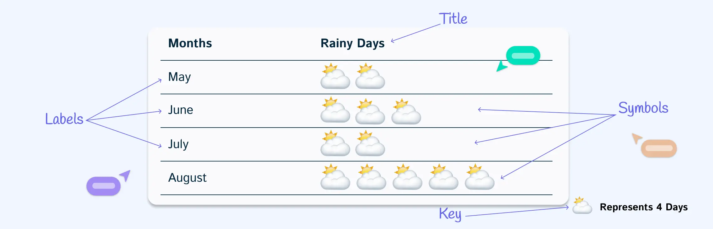
What Are the Parts of a Pictograph
A pictogram is made up of several key parts that help convey information clearly:
Title – Explains what the data is about.
Symbols or Icons – Pictures used to represent data points; each symbol stands for a specific number of items.
Key or Legend – Shows the value that each symbol represents, helping readers interpret the data correctly.
Labels – Names of the categories or groups being represented.
Scale – Indicates how many items each symbol equals, ensuring accurate comparisons.
When to Use a Pictogram
Pictograms are used in many areas because they make information easy to understand quickly. Here are some common applications:
Education – Teachers use pictograms to help students learn to read and interpret data.
Business and Marketing – Companies use pictograms to show sales figures, survey results, or customer preferences in reports and presentations.
Public Information – Governments and organizations use pictograms for signs, safety instructions, and statistical information to make it clear for everyone.
Healthcare – Hospitals and clinics use pictograms to explain medical instructions, symptoms, or health statistics.
Daily Life – Pictograms appear in weather charts, transportation signs, or event schedules to quickly convey information.
Environmental Awareness – Used in campaigns to show recycling statistics, energy usage, or pollution levels in an easy-to-read format.
How to Read a Pictograph
Step 1: Look at the title
The title tells you what the pictograph is about. For example, if the title is “Favorite Fruits of Students”, you know the chart shows which fruits students like the most.
Step 2: Check the key or legend
The key explains what each symbol represents. For instance, one apple symbol might stand for 5 students.
Step 3: Examine the symbols
Count the symbols for each category. If apples have 4 symbols and each symbol equals 5 students, that means 20 students like apples.
Step 4: Compare categories
Look at other fruits in the chart. Maybe bananas have 3 symbols (15 students) and oranges have 5 symbols (25 students). This lets you see which fruit is most or least popular.
Step 5: Draw conclusions
By comparing symbols, you can quickly understand the data. In our example, oranges are the favorite fruit, apples are next, and bananas are the least popular.
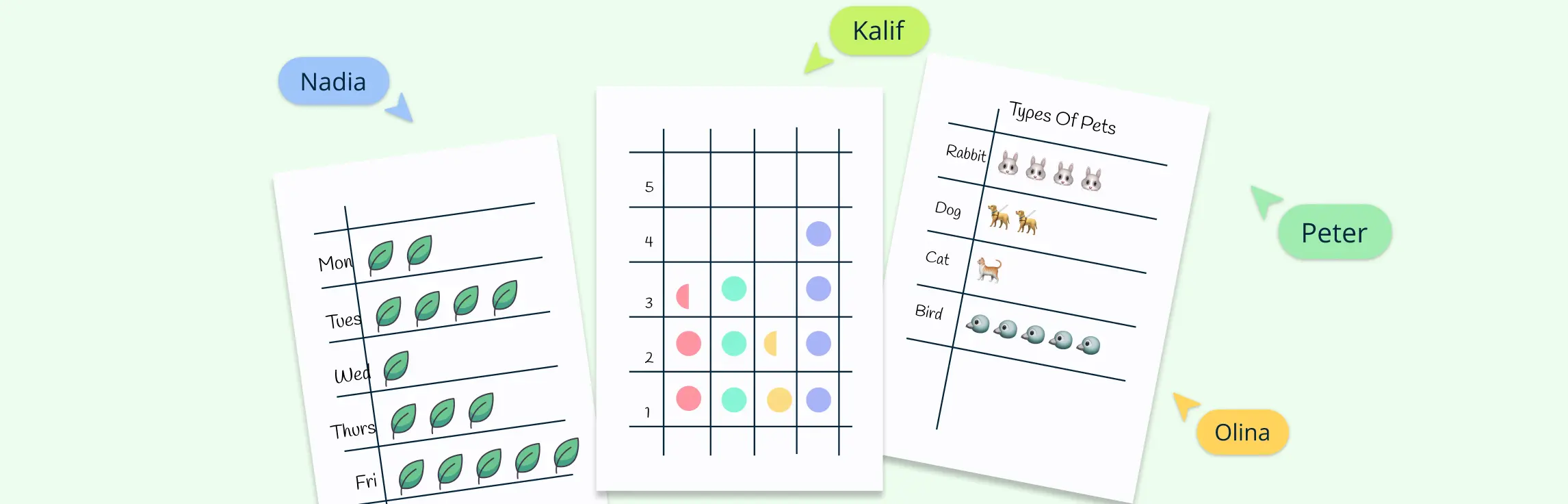
Pictograph Templates to Get Started
Now that you know what is a pictograph, here are some templates to help you get started on creating your own.
Vertical pictograph example


Pictograph of fruits

Pictograph of population

Pictograph of animals

Pictograph of sports

Advantages and Disadvantages of Pictograms
| Advantages | Disadvantages |
| Easy to understand – symbols make data clear even for people who struggle with numbers | Limited precision – symbols represent multiple items, so exact numbers are hard to show |
| Visually engaging – more interesting than plain numbers or text | Space-consuming – large datasets can make the chart crowded |
| Quick comparison – see differences between categories at a glance | Misinterpretation risk – unclear key or inconsistent symbols can confuse readers |
| Memorable – people remember visual information better | Not suitable for complex data – best for simple comparisons only |
| Great for education – helps children and beginners learn to interpret data | Time-consuming to create – designing symbols for large datasets takes longer |
References
www.sciencedirect.com. (n.d.). Pictographs - an overview | ScienceDirect Topics. [online] Available at: https://www.sciencedirect.com/topics/social-sciences/pictographs.
OUP accepted manuscript. (2020). Health Education Research. doi:https://doi.org/10.1093/her/cyaa046.
FAQs About What Is a Pictogram
How is a pictogram different from a bar graph?
What is the best tool for creating pictographs?
Who uses pictograms?
Can pictographs be used for large datasets?
What types of data work best with pictographs?
How do pictographs help in education?
How do you solve a pictograph?