Pictographs turn numbers into pictures, making data easier to read, compare, and explain. Instead of showing only figures, they use icons such as apples, trees, animals, sports equipment, or people to represent quantities.
They are especially useful in classrooms because students can visually understand patterns, compare categories, and practice reading data with the help of a simple key or legend. In this guide, we’ll look at 12 pictograph examples for students and teachers, along with notes on how each one can be used in lessons, classroom activities, surveys, and visual data projects.
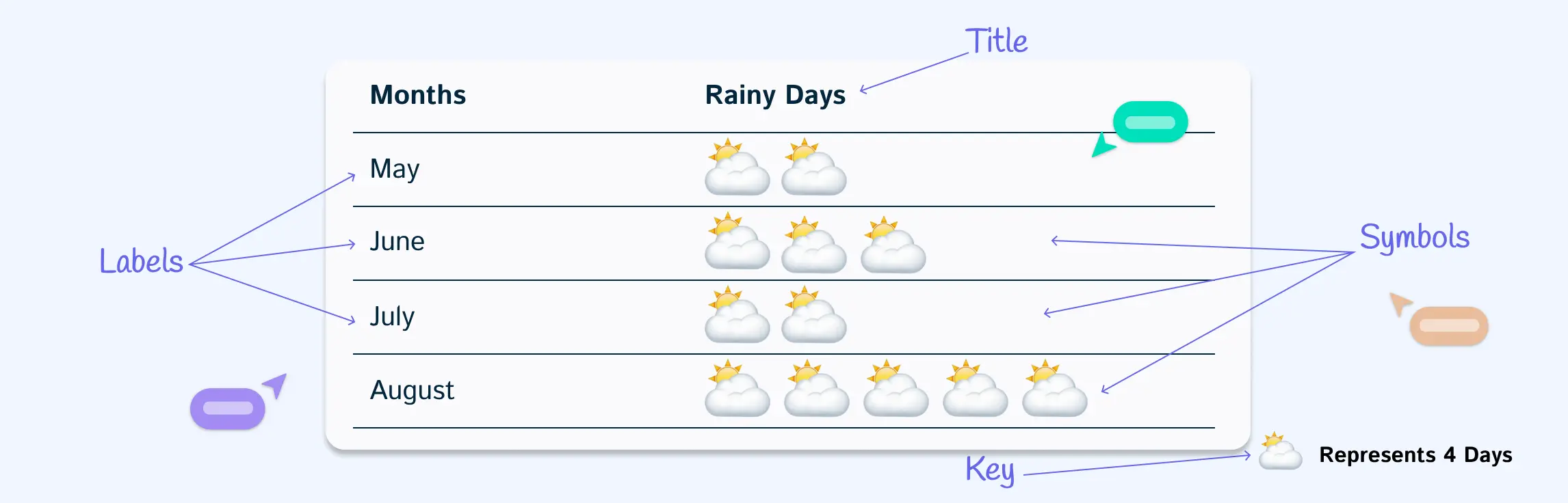
What Is a Pictograph?
A pictograph is a chart that uses pictures, icons, or symbols to represent data. Each icon stands for a specific number, which is explained in a key or legend.
For example, in a classroom fruit survey, one apple icon might represent 2 students. If there are 5 apple icons, that means 10 students chose apples. This makes pictographs useful for helping students compare data visually and understand patterns quickly.
Pictograph Examples for Quick Data Visualization
1. Horizontal pictograph example
This example of pictograph arranges icons from left to right to compare categories instantly. This format is best when you want a quick, side-by-side view of data like sales by product or survey responses.


- Best for: Grade 2 and above
- Classroom use: Comparing student votes, favorite snacks, books read, or class activity choices
- Key tip: Use the same icon size across every category so the comparison stays fair.
2. Vertical pictograph example
Stack icons upward to show growth or frequency. It works well for data that needs to highlight “tallest vs. shortest” comparisons, such as monthly attendance or product demand.

- Best for: Grade 2 and above
- Classroom use: Monthly attendance, homework completion, plant growth, or reading goals
- Key tip: Add a clear label under each column so students can easily match the icons to the category.
3. Pictograph of fruits
Replace numbers with fruit icons to represent counts. This makes it easy to visualize preferences or consumption patterns at a glance, such as how many apples, bananas, or oranges were chosen.

- Best for: Early elementary students
- Classroom use: Favorite fruit surveys, healthy eating lessons, counting practice, or data interpretation activities
- Key tip: For younger students, keep the key simple, such as 1 fruit icon = 1 student.
4. Pictograph of population
Use people icons to break down population data into simple, visual chunks. It’s an effective way to show demographics, compare groups, or represent growth trends.

- Best for: Upper elementary and middle school students
- Classroom use: Social studies, geography, demographics, or community data lessons
- Key tip: Use a scaled key, such as 1 person icon = 10 people, when working with larger numbers.
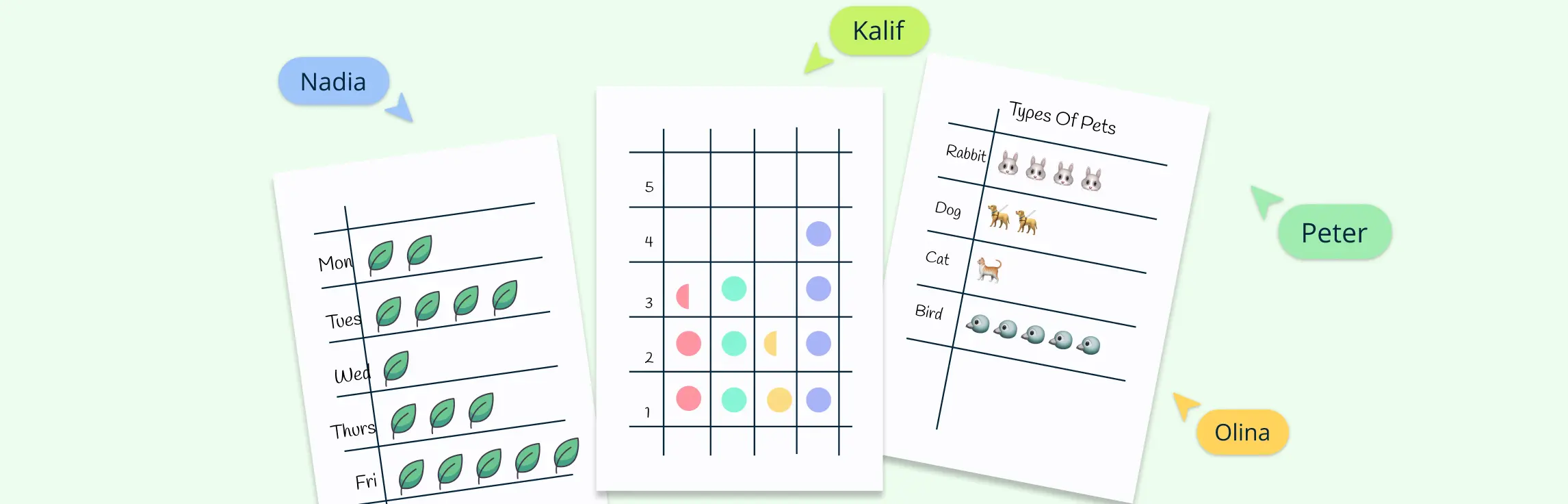
5. Pictograph of animals
Illustrate data with animal symbols to make comparisons engaging. For example, use dogs, cats, and birds to highlight survey results, wildlife counts, or pet ownership statistics.

- Best for: Early elementary students
- Classroom use: Pet surveys, animal classification, wildlife counts, or science lessons
- Key tip: Choose icons that are easy to recognize so students can read the chart without confusion.
6. Pictograph of sports
Show popularity or participation in sports by using activity-specific icons like footballs, basketballs, or rackets. It’s a simple way to turn interest or performance data into a visual story.

- Best for: Elementary and middle school students
- Classroom use: PE surveys, sports day planning, favorite sport polls, or participation tracking
- Key tip: Use one icon style per sport and avoid mixing different symbol meanings in the same chart.
7. Pictograph of trees
Track environmental or project data with tree icons. Use it to highlight the number of trees planted, compare forest areas, or monitor green initiatives over time.

- Best for: Elementary and middle school students
- Classroom use: Environmental science, Earth Day activities, sustainability projects, or community service tracking
- Key tip: Use grouped values such as 1 tree icon = 5 trees when the numbers are larger.
8. Pictograph of weather
Record daily or seasonal conditions using sun, rain, or cloud symbols. Over time, this creates an easy-to-read chart that reveals weather patterns without relying on complex graphs.

- Best for: Kindergarten to Grade 3
- Classroom use: Daily weather tracking, calendar activities, science lessons, or seasonal observations
- Key tip: Keep the icon key consistent throughout the week or month so students can compare days accurately.
9. Pictograph of flowers
Thi sample of pictograph represents quantities or types of flowers with floral icons. This is useful for showcasing garden data, species comparisons, or survey results in a visually appealing way.

- Best for: Early elementary students
- Classroom use: Garden projects, plant life cycle lessons, flower surveys, or seasonal activities
- Key tip: Use different flower icons only when each icon represents a different category.
10. Market research pictograph example
Plot survey or customer feedback data using icons that represent products or services. This turns raw research into visuals that make trends and preferences immediately clear.

- Best for: Middle school and high school students
- Classroom use: Business studies, entrepreneurship projects, product surveys, or consumer preference lessons
- Key tip: Keep the categories limited so the pictograph does not become crowded or hard to read.
11. Mode of transportation pictograph example
Display how people travel—by bus, car, bicycle, or walking—using transportation icons. It’s a practical way to compare commuting patterns or lifestyle choices.

- Best for: Elementary and middle school students
- Classroom use: Class travel surveys, geography lessons, community studies, or sustainability discussions
- Key tip: Choose one value for each icon, such as 1 vehicle icon = 2 students, and explain it clearly in the key.
12. Maths pictograph example
Use simple icons to replace numbers in math problems, such as stars for addition or subtraction. These examples of pictographs transforms abstract calculations into visuals that are easier to interpret.

- Best for: Kindergarten to Grade 3
- Classroom use: Counting, addition, subtraction, skip counting, early multiplication, or word problems
- Key tip: Start with 1 icon = 1 item before moving to scaled pictographs.
Why Choose Creately for Creating Pictographs
Creately makes building pictographs simple by combining visual tools with powerful collaboration and customization features. Here’s how its capabilities stand out:
Extensive icon and shape libraries
Quickly access ready-to-use icons for people, objects, weather, transport, and more. You can also upload custom images to match your data perfectly or use built-in Google image search to browse for more.
Customizable templates
Start with professionally designed pictograph templates for fruits, sports, transportation, or market research, and adapt them with your own data.
Flexible visual layout
Arrange icons horizontally, vertically, or in clusters to suit the story your data tells. Creately’s smart alignment and grids ensure everything looks clean and consistent.
Data import and linking
Bring in data directly from Excel, CSV, or Google Sheets and link it to shapes. This makes updating your pictograph effortless whenever the data changes.
Easy formatting and styling
Change colors, resize icons, and add labels or legends to keep your pictograph clear. You can apply themes to make visuals stand out without overcomplicating them.
Real-time collaboration
Work with your team or class on the same canvas. Creately lets you comment, react, and edit together in real time, making group projects or feedback smooth.
Seamless sharing and exporting
Export your pictograph in formats like PNG, JPEG, SVG, or PDF, or share a secure link. This makes it easy to use pictographs in presentations, reports, or classrooms.
FAQs on Pictograph Examples
What is the main purpose of a pictograph?
How do you read a pictograph?
What are the advantages of using pictograph examples?
What are the disadvantages of pictographs?
Where are pictograph examples used in real life?
Are pictographs suitable for all types of data?