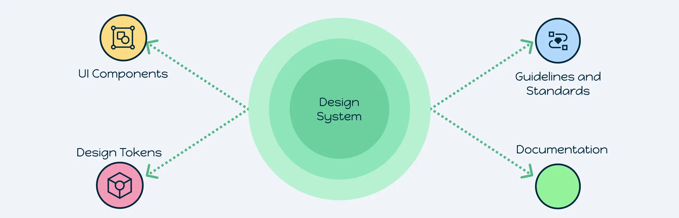
Struggling with inconsistent designs, repeated work, and misaligned teams? A design system is the solution. It’s a centralized framework that brings together reusable UI components, design tokens, and clear guidelines to create consistent and scalable digital products. Unlike standalone style guides, design systems go beyond visuals by providing governance, documentation, and standards that align design and development teams. In modern product design, they matter because they save time, reduce inconsistencies, and improve collaboration across teams. By using a shared design system, organizations achieve consistency in branding, efficiency in workflows, and smoother collaboration between designers, developers, and stakeholders.
Design System Definition and Purpose
A design system is more than just a collection of colors, fonts, or UI kits. It’s a structured framework that combines design system components like reusable UI elements, design tokens, and documentation into one cohesive ecosystem. Unlike simple style guides, a design system offers governance, usage rules, and scalability, making it a living source of truth for product teams.
It’s also important to note the difference between a design system vs. a component library. While a component library provides ready-to-use UI elements, a design system includes not just components but also the guidelines, principles, and standards that define when and how those elements should be used. This ensures that teams aren’t just reusing designs, but reusing them consistently and correctly.
Businesses adopt design systems because they accelerate development, reduce design debt, and maintain brand consistency across multiple products and platforms. For growing organizations, a well-defined design system enables teams to scale quickly while keeping the user experience seamless and cohesive.
Why Use a Design System?
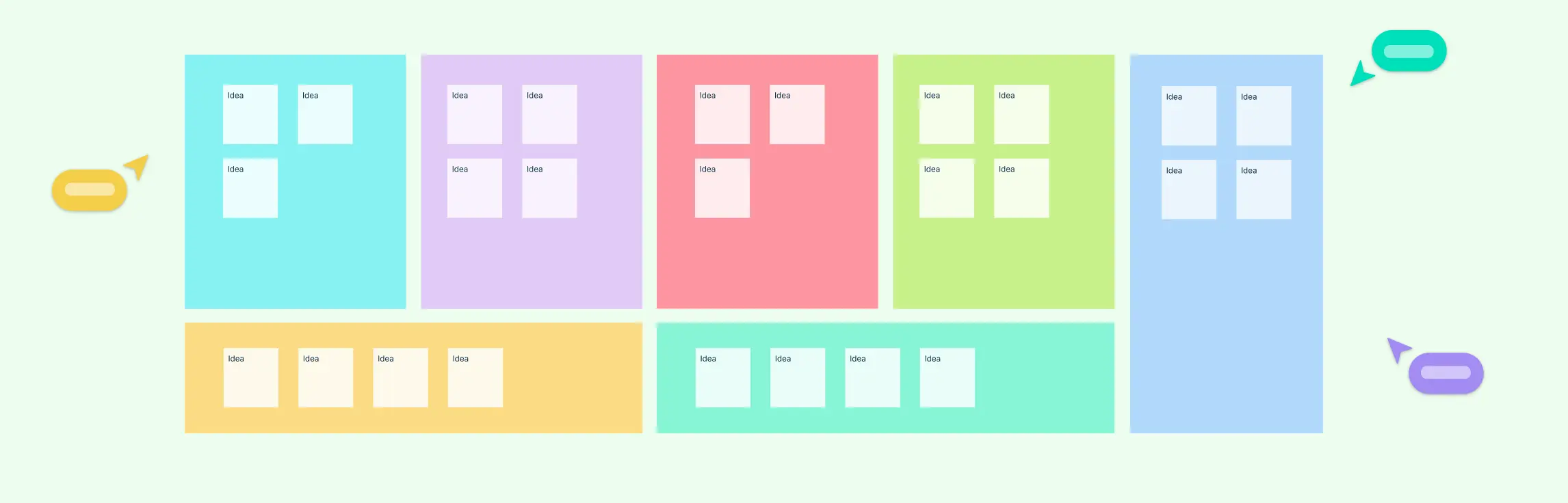
A well-structured design system brings significant value to design and development teams by streamlining workflows, ensuring consistency, and reducing repetitive work. Here are some of the key benefits:
1. Speeds up design and development at scale
By reusing prebuilt UI components and design tokens, teams can quickly create new screens, features, or products without starting from scratch. This accelerates delivery while reducing errors and inconsistencies.
2. Frees designers to focus on complex challenges
Since foundational elements like buttons, inputs, and navigation are already standardized, designers can shift their attention to solving higher-level problems such as user flows, accessibility, and information hierarchy, rather than constantly fine-tuning basic visuals.
3. Establishes a common language across teams
A design system acts as a shared vocabulary for designers, developers, and stakeholders. With clear definitions and documentation, everyone understands what a component means and how it should behave, avoiding unnecessary debates or misinterpretations.
4. Ensures brand and visual consistency
Without a design system, products across different departments or channels can feel fragmented. A unified system guarantees that every interface aligns with brand guidelines, creating a seamless and cohesive user experience across all touchpoints.
5. Acts as an educational resource
For new designers, developers, or content contributors, a design system serves as both a training tool and reference guide. Explicit rules and best practices help onboard new team members faster while reinforcing consistency for the entire team.
Key Design System Components
A design system is a complete framework made up of essential components that bring consistency, efficiency, and scalability to digital products. Below are the essential components that form the foundation of a strong design system:
1. Component Library
The component library is the backbone of any design system. It houses reusable UI elements such as buttons, forms, input fields, navigation menus, and layouts. Instead of reinventing these elements for every new page or product, teams can pull directly from the library to save time and maintain consistency. A well-structured component library:
- Speeds up front-end development by reusing tested elements.
- Creates a seamless and familiar user experience.
- Reduces visual inconsistencies across different platforms.
2. Pattern Library
While components are the building blocks, a pattern library focuses on solutions to common design challenges. Patterns define how components work together in specific contexts; for example, login flows, onboarding steps, or checkout processes. These patterns ensure that users encounter familiar, intuitive interactions across different parts of a product.
3. Brand Style Guide
A brand style guide captures the visual and verbal identity of an organization. It includes details such as typography, color schemes, logos, imagery, and tone of voice. Designers, marketers, and content creators rely on this guide to ensure all outputs reflect the brand consistently, whether it’s a web app, a social media post, or printed material.
4. Brand Values
Design systems are not only about aesthetics, they’re also shaped by brand values. These are the guiding principles that reflect what the brand stands for. Whether it’s inclusivity, simplicity, or innovation, brand values influence design decisions and help create experiences that feel authentic and aligned with the company’s mission.
5. Design Principles
Design principles serve as high-level rules that keep teams aligned. They answer the “why” behind design choices, ensuring every decision supports usability, accessibility, and aesthetics. For example, principles like “mobile-first design” or “clarity over decoration” set the tone for how products should be built and refined.
6. Icon Library
Icons are small but powerful elements of a design system. An icon library ensures visual consistency when communicating actions, statuses, or navigation. Standardized icons (e.g., for search, notifications, or settings) make interfaces more intuitive and reduce cognitive load for users.
7. Content Guidelines
Great design is incomplete without great content. Content guidelines establish rules for tone, style, grammar, and vocabulary, ensuring a consistent brand voice across interfaces, documentation, and marketing. They help writers and designers collaborate smoothly while avoiding confusing or inconsistent messaging.
8. Accessibility Guidelines
Accessibility isn’t optional, it’s a necessity. Accessibility guidelines ensure that products are usable by everyone, including people with disabilities. These rules cover aspects like color contrast, font size, keyboard navigation, and screen reader compatibility. By embedding accessibility into the design system, teams create more inclusive and user-friendly experiences.
9. Design Tokens
Design tokens are the smallest units of a design system. Instead of hardcoding values like hex codes or pixel dimensions, tokens define reusable variables such as primary-color or heading-font-size. Changing a token updates all instances where it’s used, making large-scale design changes fast and efficient. Tokens enable scalability, flexibility, and consistency across multiple platforms.
Design System Examples for Real-Life Use Cases
1. E-commerce Website Design System
An e-commerce design system ensures a consistent shopping journey from browsing to checkout. It includes reusable components like product cards, navigation menus, and add-to-cart buttons, with design tokens for brand colors and typography. Responsive and accessibility guidelines keep the experience seamless across devices.


2. SaaS Dashboard Design System
For data-heavy tools, a SaaS dashboard design system standardizes charts, tables, filters, and notifications. Color-coded tokens and grid layouts improve readability, while documentation aligns designers and developers to ensure accuracy and efficiency.

3. Mobile App Design System
Mobile app systems provide reusable elements like tab bars, gestures, and onboarding flows for iOS and Android. Tokens manage platform-specific typography and spacing, while guidelines ensure accessibility, smooth motion, and native-feeling navigation.

4. Corporate Branding & Marketing Design System
This system maintains brand consistency across campaigns with logo variations, banners, CTAs, and social templates. Tokens for colors, fonts, and icons, plus guidelines on tone and hierarchy, ensure cohesive branding across teams and channels.

5. Educational Platform Design System
Educational systems support learning consistency with lesson cards, progress trackers, and interactive hints. Tokens define subject-based colors and readable typography, while guidelines ensure accessibility and responsive layouts for all learners.

In today’s fast-paced digital landscape, a design system is more than just a toolkit. It’s a strategic framework that ensures consistency, efficiency, and collaboration across teams. By defining reusable components, design tokens, and guidelines, organizations can scale products seamlessly while maintaining a cohesive user experience. Whether you’re building an e-commerce site, SaaS dashboard, mobile app, or educational platform, implementing a design system streamlines workflows and reduces errors. Start creating your own design system today using ready-to-use templates or tools like Creately, and empower your team to design and build smarter, faster, and more consistently.
FAQs About Design Systems
How does a design system improve team collaboration?
Can small teams benefit from a design system?
How often should a design system be updated?
What tools can help create and manage a design system?
How does a design system differ from a pattern library?
