
Are your design teams struggling with inconsistent interfaces, slow development cycles, or endless revisions? A digital design system can solve these pain points by centralizing your UI/UX assets, standardizing components, and creating a single source of truth for your entire organization. From design tokens to component libraries and governance workflows, a digital design framework ensures your products are consistent, scalable, and easier to manage, helping teams save time, reduce errors, and deliver superior user experiences across platforms.
What Is a Digital Design System?
A digital design system is a centralized framework that unifies design and development processes, ensuring consistency, scalability, and efficiency across digital products. Unlike a simple style guide that only outlines colors, fonts, and basic visual rules, a digital design framework goes deeper by providing a living library of UI components, design tokens, and comprehensive documentation that teams can reuse and scale across projects.
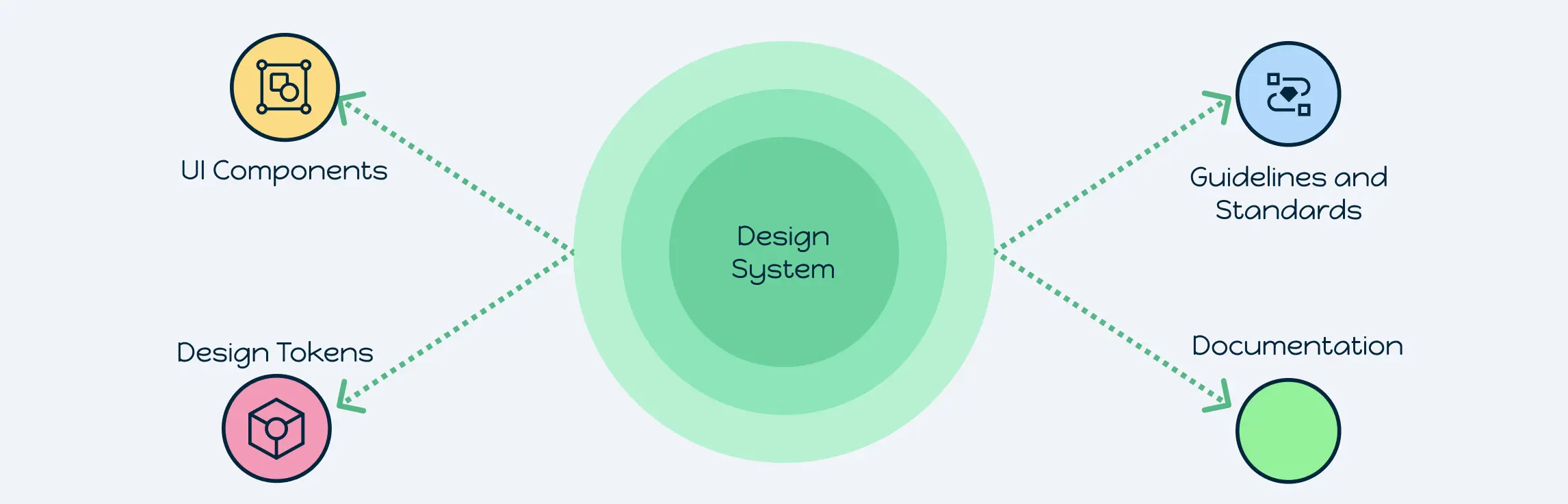
Key Elements of a Digital Design System
A well-structured digital design system depends on several essential components that ensure consistent, scalable, and efficient design across products. Teams can even outline the system architecture visually using tools like an app development canvas.
UI Components & Patterns
- Component Library: A catalog of buttons, forms, cards, modals, and other reusable UI elements, complete with code snippets and usage guidelines.
- Pattern Library: Reusable interaction patterns such as navigation bars, grid layouts, and accordions that help create predictable and seamless user flows.
Design Tokens & Branding Elements
- Design Tokens: Centralized variables for colors, typography, spacing, shadows, and animations that act as a single source of truth across all products.
- Brand Style Guide: Documentation covering logo usage, color palettes, iconography rules, and voice and tone principles, reinforcing brand identity and consistency.
Documentation & Guidelines
Comprehensive instructions for accessibility compliance, contribution processes, component anatomy, and design rationale ensure teams understand how and when to use each element, promoting UX consistency across projects.
Governance & Version Control
Defined roles, review workflows, release notes, changelogs, and semantic versioning policies help manage updates efficiently, keeping the design system scalable and adaptable as products evolve.
By combining these core elements, a digital design blueprint becomes a living resource that drives collaboration, reduces design inconsistencies, and strengthens brand consistency across digital products.
Advantages of Implementing a Digital Design System
Adopting a digital design framework offers numerous benefits for teams aiming to scale design operations, streamline workflows, and deliver consistent user experiences. By centralizing UI/UX processes and maintaining a single source of truth, design systems make design and development more efficient, predictable, and collaborative.
- Consistency & Brand Integrity: Maintain a uniform look and feel across products, platforms, and touchpoints, reinforcing brand recognition.
- Efficiency & Speed: Reusable assets, UI components, and code snippets accelerate prototyping and front-end development cycles.
- Collaboration & Alignment: Shared visual tools, version history, and a common language bridge designers, developers, and stakeholders.
- Scalability: Onboarding new team members and expanding to new platforms becomes systematic and predictable.
- Cost Reduction: Fewer UI bugs, less rework, and lower maintenance overhead reduce the total cost of ownership.
How It Works in Practice:
- Centralized assets act like a library management system; components, design tokens, and documentation are cataloged, versioned, and easily retrievable.
- Integrated software allows teams to track contributions, enforce access controls, and monitor usage metrics.
- Design Tokens: Represent visual decisions (colors, typography, spacing) as data, enabling cross-platform consistency, dark-mode theming, and customizable themes without manual restyling.
- Component Libraries: Combined with tokens, they ensure design updates propagate automatically, maintaining reliability across products.
Governance & Updates:
- Define roles, review workflows, and version control policies to prevent fragmentation.
- Set up regular audits to update components, tokens, and documentation.
- Include real-world examples: e.g., updating a button style in the library automatically reflects across all screens in a product suite.
By transforming static assets into a dynamic, adaptive ecosystem, a digital design system encourages collaboration through real-time editing, annotation tools, and automated documentation. Teams experience faster design handoffs, fewer revisions, and accelerated product delivery, all while maintaining brand consistency and superior UX.
How Creately Can Help You Create and Manage a Digital Design System
Managing a digital design framework can feel overwhelming; between maintaining UI components, tracking design tokens, enforcing governance, and keeping multiple teams aligned, things can quickly spiral out of control. Creately simplifies this process by giving you a single, visual platform where you can create, organize, and evolve your digital design blueprint with ease.
Centralized Component & Pattern Libraries
With Creately, you can visually map and store your UI components, reusable design patterns, and tokens in one place. Instead of scattered files, your team gets a shared library of buttons, navigation bars, typography, and other elements, ready to be dragged into workflows or referenced instantly.
Real-Time Collaboration & Updates
Building a digital design framework isn’t just for designers; it’s a team effort across developers, product managers, and stakeholders. Creately enables real-time co-creation, comments, and annotations so everyone stays aligned. Every update is visible instantly, ensuring consistent brand experiences at every touchpoint.
Templates to Kickstart Your System
What makes Creately a better digital design system tool is the ability to create your own reusable templates. Teams can customize layouts, map component flows, or define brand assets once and save them as templates. This way, every new project begins with the same standardized framework, ensuring consistency, saving time, and reducing the risk of design drift.
Seamless Integration & Scalability
Your digital design framework doesn’t exist in isolation. With integrations into tools like Jira, Confluence, and Figma, Creately ensures your system scales across multiple teams and projects. Built-in access controls and contribution workflows keep everything structured, even as your system expands.
Governance & Version Control Made Simple
One of the biggest challenges in managing a digital design system is governance. With Creately, you can assign roles, track contributions, and document version changes in an organized way. Release notes and structured updates prevent fragmentation while ensuring every team is always working with the latest standards.
With its visual-first approach, Creately makes creating and managing a digital design framework intuitive, collaborative, and future-proof. Instead of getting lost in scattered documents and tools, you’ll have a single source of truth that grows with your brand.
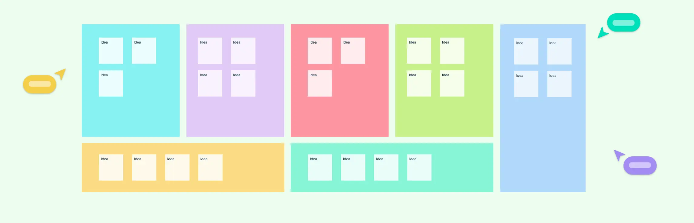
Free Templates to Kickstart Your Digital Design System
Building a digital design framework from scratch can feel overwhelming, especially when teams need to maintain consistency, scalability, and efficiency across multiple products. To simplify this process, we’ve created a set of ready-to-use templates that serve as your foundation. These templates provide structure, guidance, and practical examples, allowing your team to implement a robust design system faster and more effectively.
1. E-commerce Website Design System
Ensure a seamless shopping journey with reusable components like product tiles, navigation bars, and checkout flows. Design tokens capture brand colors and fonts, while accessibility and responsive rules guarantee a smooth experience across devices.


2. SaaS Dashboard Design System
Standardize data-heavy dashboards with reusable charts, tables, filters, and alerts. Grid layouts and color-coded tokens improve usability, while documentation keeps designers and developers aligned for faster delivery.

3. Mobile App Design System
Build consistent iOS and Android apps with shared tab bars, gesture patterns, and onboarding flows. Platform-specific tokens handle spacing and typography, while motion and accessibility guidelines ensure smooth, native-like navigation.

4. Corporate Branding & Marketing Design System
Keep branding cohesive across campaigns with pre-built logo rules, ad banners, CTAs, and social media assets. Tokens define fonts, icons, and palettes, while tone and hierarchy guidelines unify cross-team efforts.

5. Educational Platform Design System
Support engaging, consistent learning experiences with templates for lesson cards, progress indicators, and interactive hints. Subject-based color tokens and clear typography enhance readability, while responsive layouts ensure accessibility for all learners.

Implementing a digital design framework transforms scattered design assets into a cohesive, reusable, and scalable ecosystem. By standardizing components, design tokens, and governance processes, teams can streamline workflows, maintain brand consistency, and accelerate product delivery. Ready to simplify your design process and improve collaboration? Start building your digital design system today with our ready-to-use templates and practical guidelines.
FAQs About Digital Design System
Can small teams benefit from a digital design framework?
How often should a digital design system be updated?
How does a digital design framework improve collaboration between designers and developers?
Can a digital design framework support accessibility compliance?
