
Struggling with inconsistent interfaces, duplicated design work, and misaligned teams? That’s a common challenge when products grow without a unified system. Design system components solve this by providing reusable UI elements, standardized styles, and clear guidelines that bridge design and development. With a well-structured design system components library, teams can reduce errors, accelerate feature delivery, and maintain a cohesive user experience, ensuring every designer and developer references the same source of truth
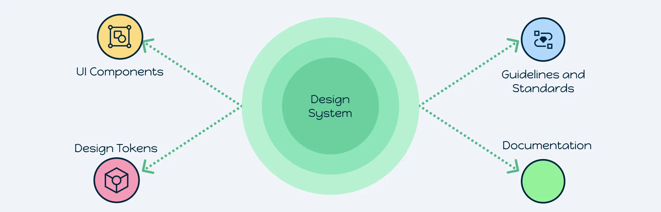
What Are Design System Components?
Design system components are the reusable building blocks of a digital product’s user interface. Each design component combines style specifications, interaction patterns, and coded logic into a single, standardized element. Unlike standalone assets such as icons or mockups, design components are part of a larger system that ensures consistency and scalability across platforms.
Think of them as the bridge between design decisions and actual product development. Buttons, forms, navigation bars, cards, and modal dialogs are common examples. Instead of reinventing these elements every time, teams rely on a design system components library, a single source of truth where all approved patterns are stored, documented, and versioned.
By centralizing design components, teams avoid duplication, reduce errors, and create a unified experience for users. This makes them different from one-off design files: components are living, evolving parts of a system that can be updated globally, ensuring changes cascade across every project that uses them.
Key Types of Design System Components
A robust design system components list forms the backbone of any scalable, maintainable digital product. Each component type plays a specific role in ensuring consistency, usability, and efficiency across design and development teams. Below, we break down the most critical categories of design system components and explore their purpose, implementation, and best practices.
1. Brand Styles
Brand styles define a product’s visual identity, ensuring users recognize the interface and experience a cohesive aesthetic across all touchpoints. These components are often the first elements designers and developers standardize.
Key elements include:
- Color Palette:
- Primary and secondary colors for branding.
- Semantic colors for UI states such as success, error, warning, and info.
- Guidelines for gradients, transparency, and color usage across light and dark themes.
- Tokens linking color variables directly to code for seamless updates.
- Typography:
- Standardized font families, sizes, line heights, and letter spacing.
- Hierarchical scales for headings, body text, captions, and buttons.
- Tokens for responsive typography to maintain readability across devices.
- Iconography:
- Standardized icons with defined sizes, stroke widths, and semantic meaning.
- Usage rules for interactive states (hover, active, disabled).
- Integration into UI patterns like buttons, lists, and notifications.
Best Practices:
- Convert all brand style elements into tokens to automate updates across the design system.
- Ensure cross-platform consistency: brand styles should look identical on web, iOS, and Android.
- Include examples of correct and incorrect usage to reduce design ambiguity.
2. UI Patterns & Modules
UI patterns and modules are the reusable building blocks of product interfaces. Each design component in this category is designed to solve a recurring UX problem while maintaining consistency.
Common examples:
- Navigation Bars & Menus: Horizontal, vertical, and responsive variations, including mobile adaptations.
- Forms & Input Fields: Standard fields, checkboxes, radio buttons, toggles, labels, validation messages, and error states.
- Cards & Tiles: Modular content containers with defined spacing, shadows, and alignment.
- Modals & Dialogs: Overlay components with focus management, animations, and accessibility support.
- Buttons & Call-to-Actions: Primary, secondary, tertiary, and icon buttons with defined states, spacing, and responsive behavior.
Implementation Tips:
- Document responsive behaviors for each pattern, including breakpoints and content adjustments.
- Include annotated diagrams for spacing, alignment, and padding rules.
- Provide prebuilt code snippets for each module to speed up development.
Why It Matters:
By including UI patterns in your design system components library, teams avoid inconsistent layouts, reduce duplicated effort, and accelerate product iteration. A well-documented UI module acts as a blueprint for designers and developers alike.
3. Design Tokens
Design tokens are atomic variables that define the visual properties of a design system component. They translate design decisions into reusable, scalable code.
Key categories of tokens:
| Token Type | Purpose | Example |
| Color | Primary, secondary, semantic colors | #0052CC |
| Typography | Font families, sizes, weights | Roboto, 14px, Regular |
| Spacing | Margin and padding increments | 8px, 16px, 32px |
| Shadows | Elevation, focus shadows | 0 4px 8px rgba(0,0,0,0.1) |
| Radii | Corner rounding for UI elements | 4px, 8px |
| Motion | Animation duration, easing | 200ms ease-in-out |
Benefits:
- Supports platform parity across web, iOS, and Android.
- Enables dynamic theming and rapid visual updates.
- Reduces errors by centralizing all design decisions in a single source of truth.
Best Practices:
- Maintain tokens in a shared repository with version control.
- Automate syncing tokens with component code for live updates.
- Document token usage and naming conventions in your design system components checklist.
4. Accessibility Rules
Accessibility is essential for creating inclusive products. Every design system component should comply with accessibility standards from the start, reducing costly retrofits.
Core considerations:
- Contrast Ratios: Minimum of 4.5:1 for normal text and 3:1 for large text, including backgrounds, buttons, and icons.
- Keyboard Navigation: All interactive components must be operable using only a keyboard.
- ARIA Roles & Labels: Embed semantic roles, states, and labels directly within components.
- Responsive Text & Zoom: Support scalable fonts and layout adjustments for users with visual impairments.
- Focus Indicators: Ensure visible focus outlines for interactive elements.
Best Practices:
- Test components with accessibility tools like Lighthouse, Axe, or WAVE.
- Include examples of accessible vs inaccessible implementations in your design system components list.
- Make accessibility a requirement for every new component before it is added to the library.
5. Documentation
Comprehensive documentation ensures design components are used correctly and consistently across teams. Without proper guidance, even well-designed components can be misapplied, reducing their effectiveness.
What to include in documentation:
- Component Anatomy: Visual breakdowns of padding, spacing, and alignment.
- Usage Guidelines: Contexts where components should be applied, including do’s and don’ts.
- Code Snippets: Ready-to-use examples in popular frameworks like React, Vue, Angular, or Web Components.
- Version History & Deprecation Notes: Track changes, retired components, and migration paths.
- Interactive Demos: Live previews embedded in Storybook, Zeroheight, or Creately templates.
Best Practices:
- Keep documentation close to the actual components to reduce context switching.
- Encourage feedback from designers and developers to refine usage guidelines.
- Integrate inline notes for component variants, edge cases, and responsive behaviors.
Free Templates to Kickstart Your Design System
Starting a design system from scratch can feel overwhelming. That’s where Creately templates come in: pre-built, structured resources that help teams organize, document, and scale their design system components efficiently. By leveraging these templates, you save time, reduce errors, and ensure consistency across your UI.
1. Corporate Branding & Marketing Design System
A corporate branding and marketing design system keeps campaigns consistent across teams and channels. It includes logo variations, CTAs, ad banners, and social templates, all governed by tokens for colors, fonts, and iconography. Guidelines define tone, messaging hierarchy, and layout usage, ensuring brand identity stays strong and unified in every piece of communication.


2. Mobile App Design System
A mobile app design system ensures consistency across iOS and Android by providing reusable elements like tab bars, gesture interactions, and onboarding flows. Tokens manage typography, spacing, and themes tailored to each platform. Clear guidelines cover accessibility, motion design, and navigation standards to create apps that feel smooth, intuitive, and native.

3. E-commerce Website Design System
An e-commerce design system helps create a seamless shopping experience from product discovery to checkout. It includes reusable components such as product cards, navigation menus, filters, and add-to-cart buttons. Design tokens define brand colors, typography, and spacing, while responsive rules and accessibility standards ensure the storefront looks polished and works flawlessly across all devices.

4. SaaS Dashboard Design System
A SaaS dashboard design system brings clarity and consistency to data-heavy tools. It standardizes charts, tables, filters, and notifications, ensuring teams don’t reinvent these critical UI patterns. With color-coded tokens, grid-based layouts, and structured documentation, this system improves readability while keeping designers and developers aligned for efficiency and accuracy.

5. AI Design System Template
The AI Design System Template leverages AI to help you generate a scalable design system components library in seconds. Instead of starting from a blank canvas, teams can use AI-powered suggestions to quickly create styles, tokens, and reusable components — then customize them to fit brand and product needs.

Investing in design system components transforms scattered design efforts into a structured, scalable system that grows with your product. By starting with templates, documenting your components, and centralizing your library, your team can work faster, reduce inconsistencies, and deliver exceptional user experiences. Start building your design system components library today with Creately and turn your UI into a unified, maintainable, and future-ready system.
FAQs About Design System Components
How do design system components improve cross-platform consistency?
Can design system components include interactive or animated elements?
How should teams handle deprecated design system components?
What role do design system components play in accelerating onboarding for new team members?
How can design system components support accessibility beyond basic guidelines?
